H.C.A Melbye
Four generations, one family, a portfolio of very different businesses - H.C.A Melbye needed a single identity that could hold all of it.
Sometimes the best place to look forward is back.
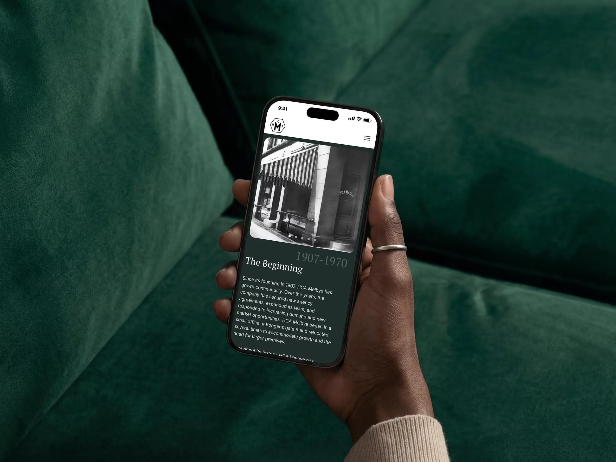
The new identity takes its starting point in H.C.A. Melbye’s own visual history. We modernised the original mark, carrying its distinctive forms and character into a cleaner, more flexible identity system. Alongside the primary logo, we developed a family of marks - including a simplified submark, logotype and Melbyemannen - allowing the identity to shift between formal, functional and a little more playful.
History wasn’t something we wanted to recreate exactly. It was something to build from.
That thinking continues throughout the visual identity. Deep forest green, blue, purple and wine tones sit alongside warm linen and a sharp yellow accent. Contemporary sans-serif typography meets a more traditional serif. Archival photographs live alongside images of the people, places and businesses that make up H.C.A. Melbye today. Old and new, without pretending there’s a line between them.
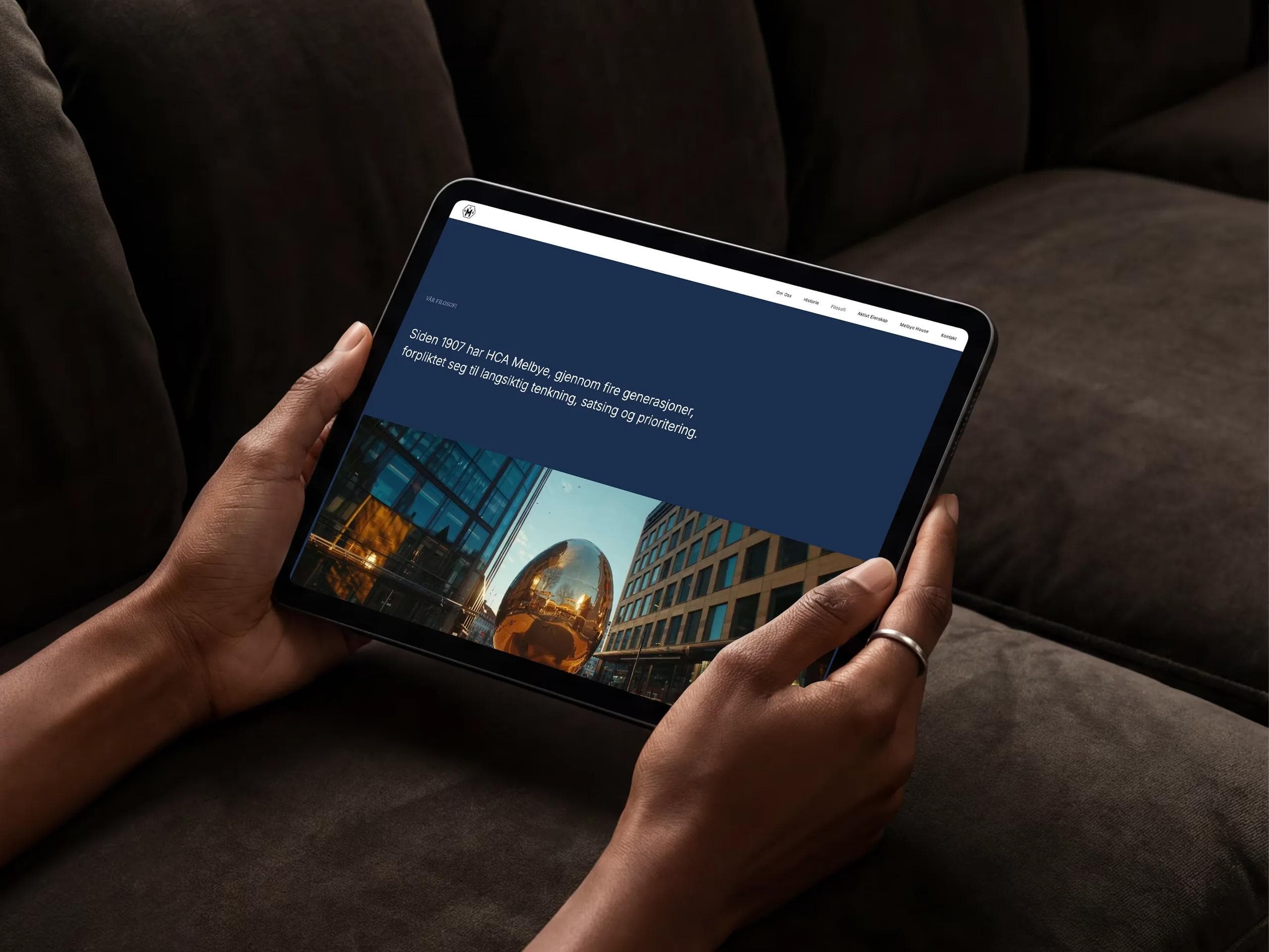
The website became a house for that story.
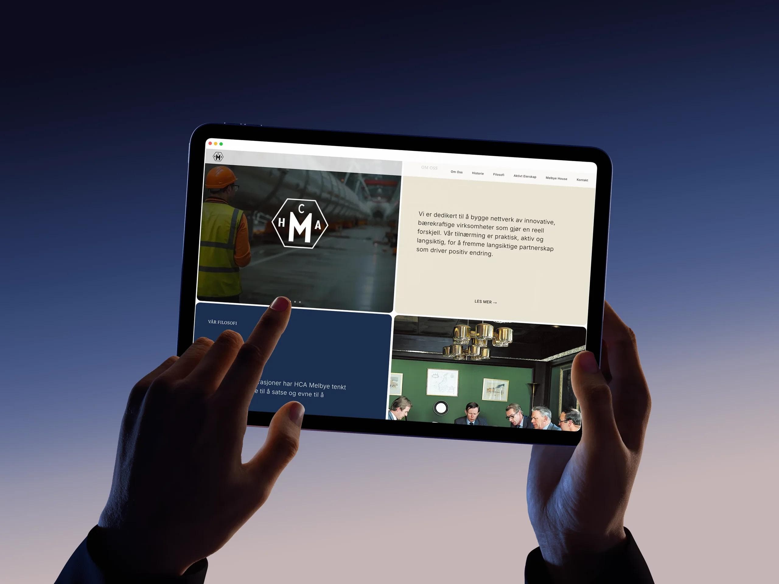
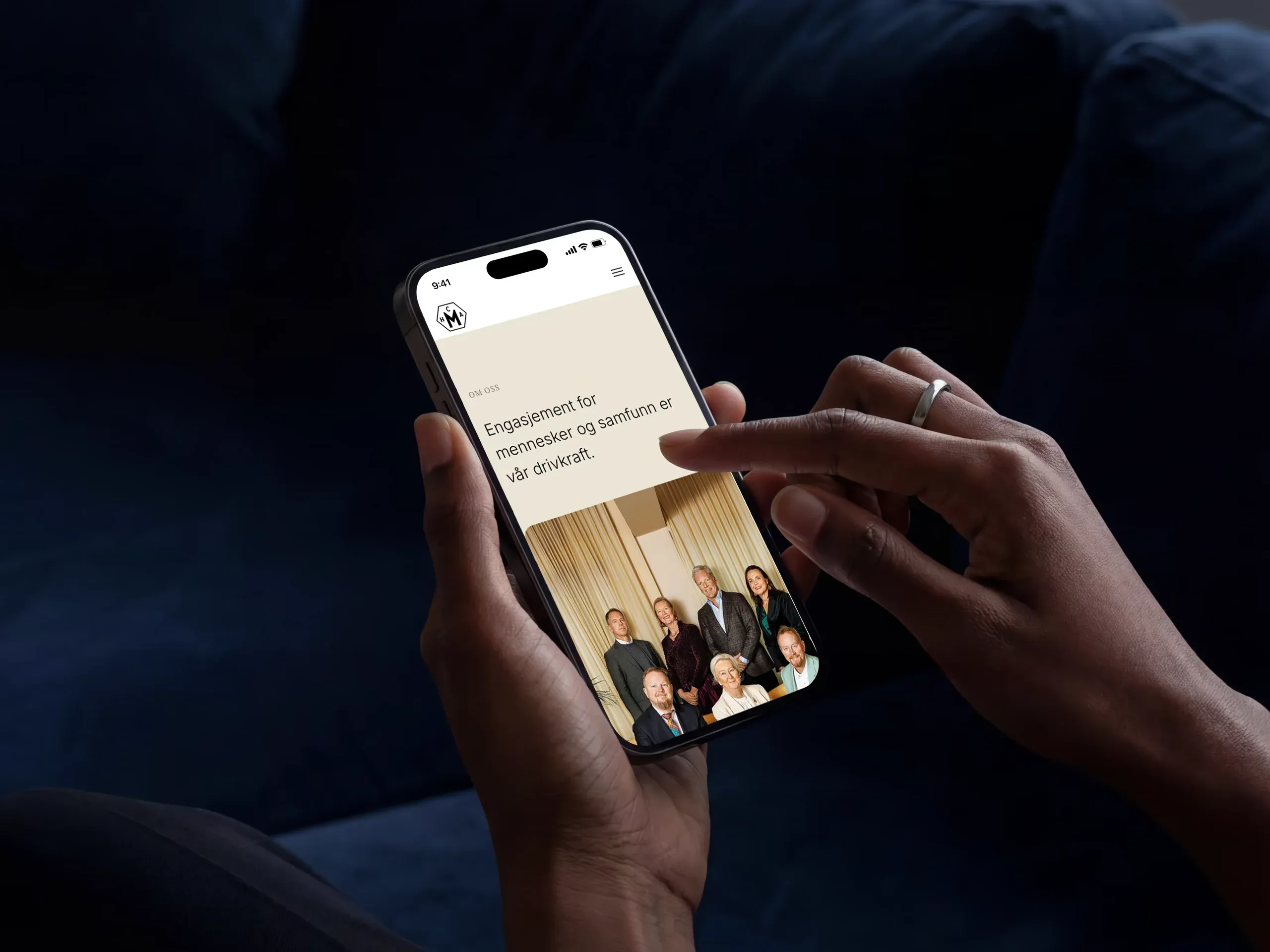
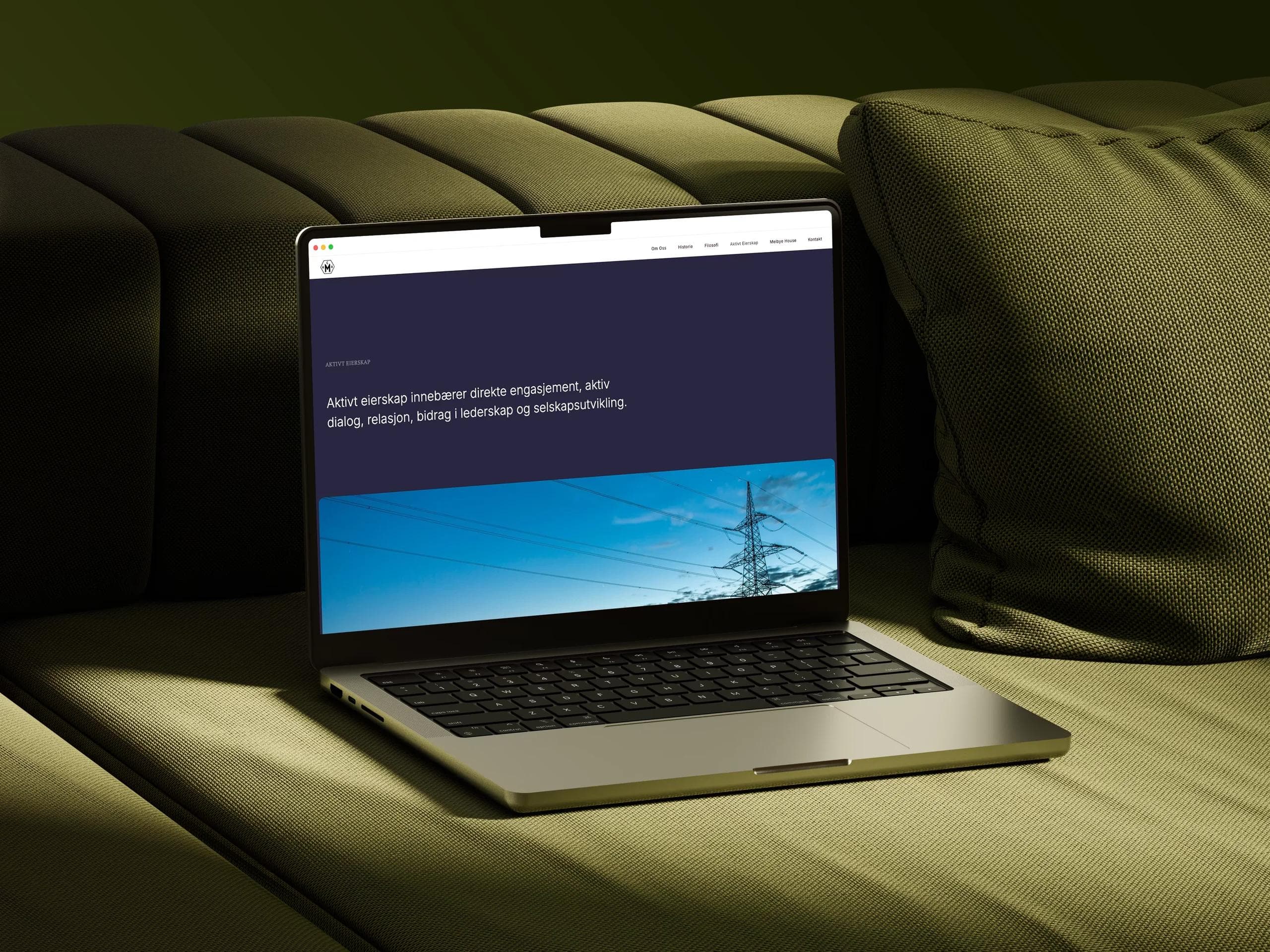
We didn’t want H.C.A. Melbye to look or sound like another investment company. The business is built around people, relationships and long-term involvement, so the digital experience needed to feel equally personal. Rather than organising everything around corporate structures, we built the experience around the things that define the company: Om oss, Historie, Filosofi, Aktivt Eierskap and Melbye House. Different rooms, in a way, within the same house.
The visual system gives those stories space to breathe. Large typography and photography sit alongside quieter editorial moments. Archival material meets contemporary imagery. Small interactions add movement and character without competing for attention.
The result feels considered, but not overly polished. Established, but still curious.

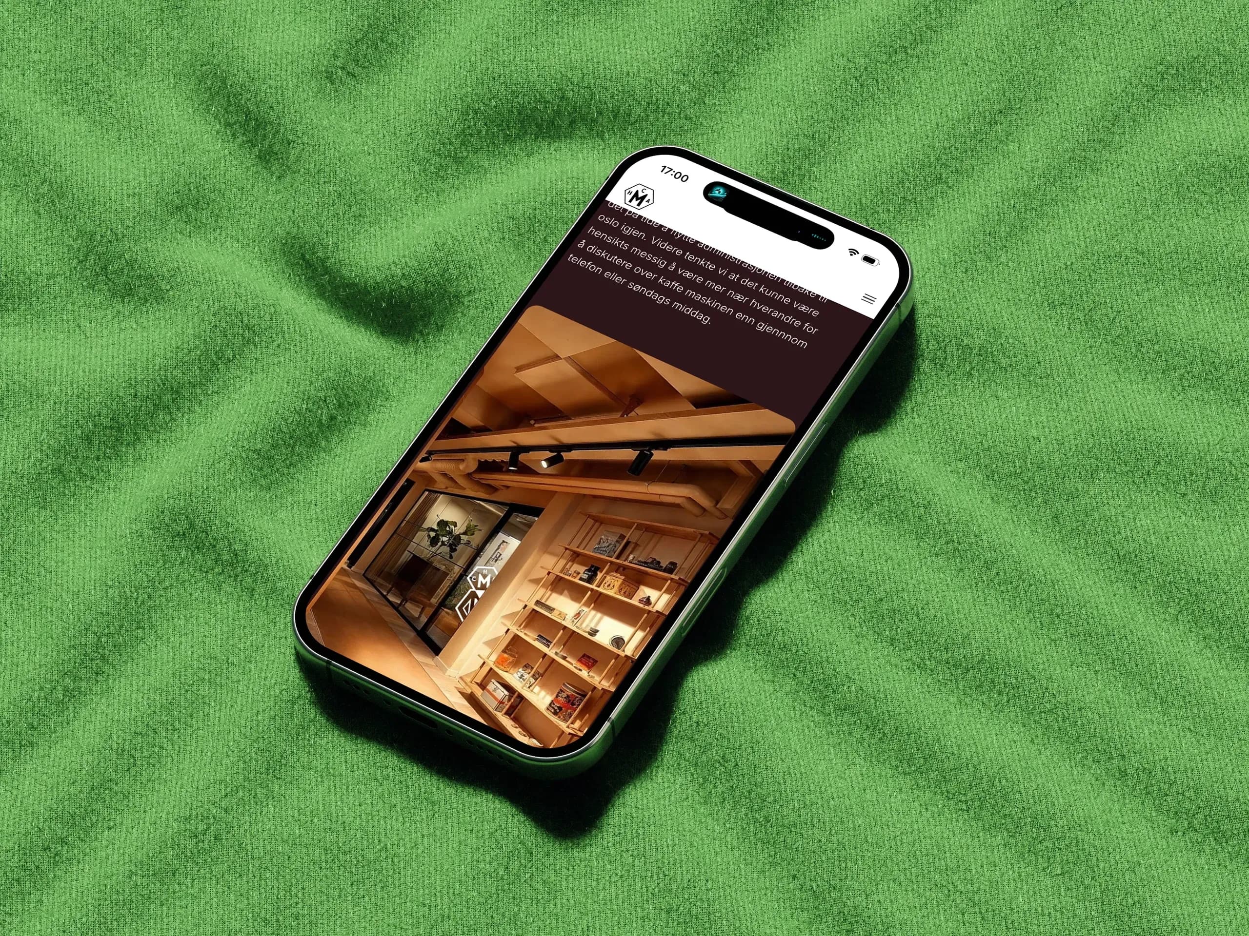
A house is more than an address.
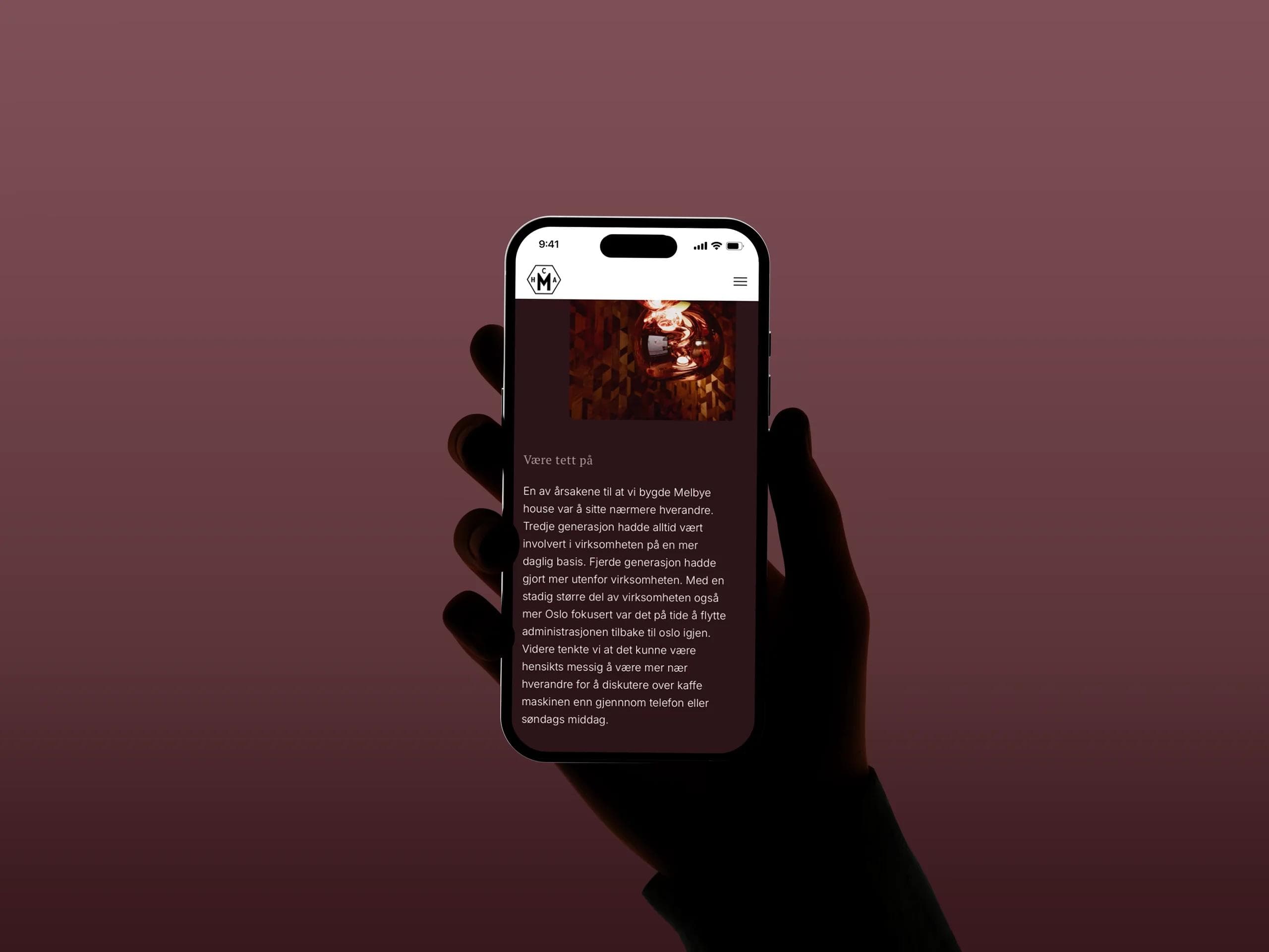
Melbye House became an important part of the story. It isn’t simply the company’s office. It’s a meeting place — somewhere relationships are built, ideas develop and conversations have time to become something more.
Et hjem hjemmefra. A home away from home. That gave us another way of talking about H.C.A. Melbye. Less as an abstract holding company and more as a family of people, businesses, ideas and relationships gathered around the same table.
A portfolio is more than a collection of logos.
The same thinking shaped how we presented the companies H.C.A. Melbye works with. Rather than reducing the portfolio to a conventional logo grid, we wanted to communicate the relationships behind it. H.C.A. Melbye describes its approach as active ownership and partnership - practical, engaged and long-term.
The design gives each company its own space while keeping it connected to the larger H.C.A. Melbye story. Because what connects these businesses isn’t what they make. It’s how H.C.A. Melbye chooses to work with them.
Some stories are better told than written.
More than a century of family history could easily have become a very long timeline.
We chose another way.
We asked the family to tell the story themselves and created a short, podcast-style audio experience around their voices. Instead of reading about four generations from a distance, you can listen to the people behind the company talk about where it came from, what changed along the way and what has stayed remarkably consistent.
The audio story is embedded directly into the experience as a full-width or centered player, with its own visual treatment - something to stop and listen to, rather than another piece of decoration.
History becomes a voice rather than a paragraph.
Rooted in where it came from. Ready for what comes next.
The result is an identity and digital experience that feel unmistakably H.C.A. Melbye — established without feeling old, personal without becoming nostalgic, and flexible enough to grow with the family and its businesses.
From a historical mark to a complete visual identity, and from more than a century of family history to a digital experience, we brought the different parts of H.C.A. Melbye together into one coherent expression.
Not a reinvention, but a clearer expression of what was already there — and a stronger foundation for what comes next.