People Who Create Cities
Designing a website for Byverkstedet, a collective that makes cities more inclusive through participation, co-creation, design, crafts, and architecture.
Byverkstedet is a collective working with urban development through participation, co-creation, design, crafts, and architecture. They needed a website that communicates who they are and what they do — people who create cities.
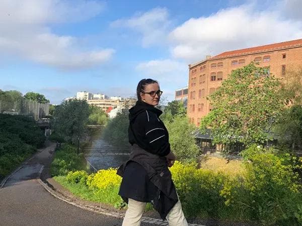
They already had a new logo and beautiful photography by Oda, which gave us a strong foundation. Together with Jinn and the rest of the Byverkstedet team, we agreed on the most important message: these are people who make cities more inclusive.
People = Cities
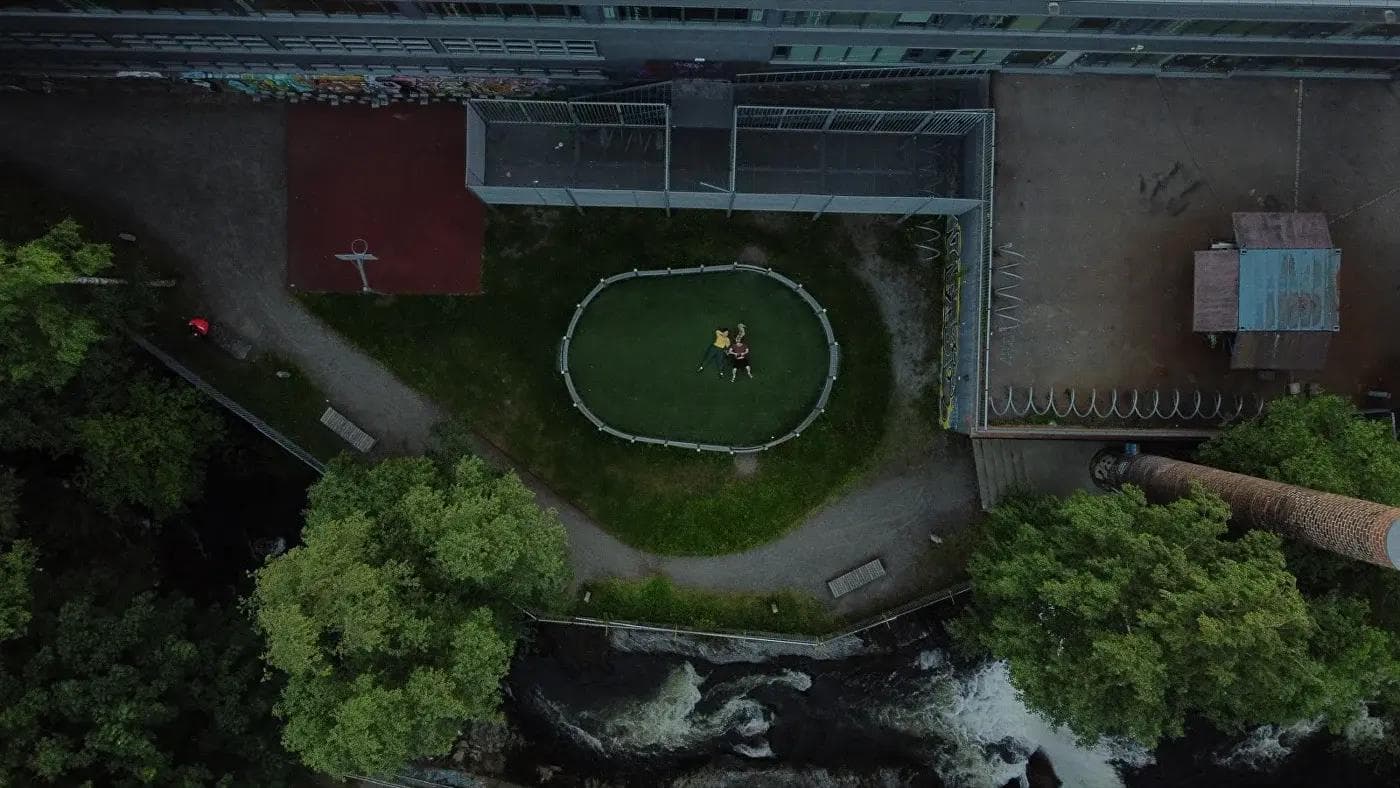
The core insight was simple but powerful: Byverkstedet's work is fundamentally about people shaping their own environments. The website needed to reflect this — not by talking about processes and methodologies, but by showing the people and the places they transform.
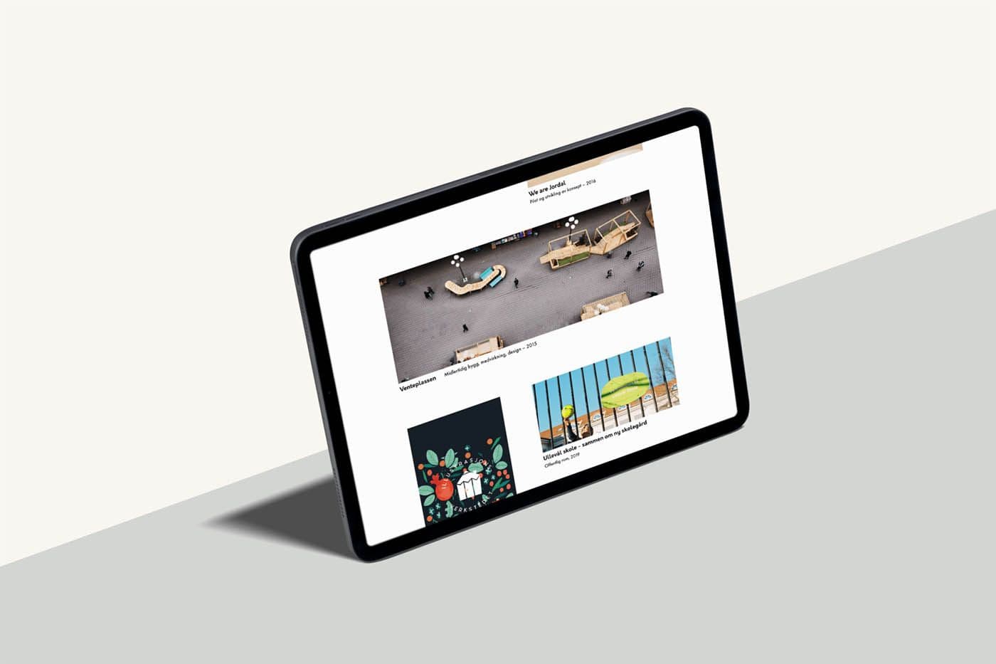
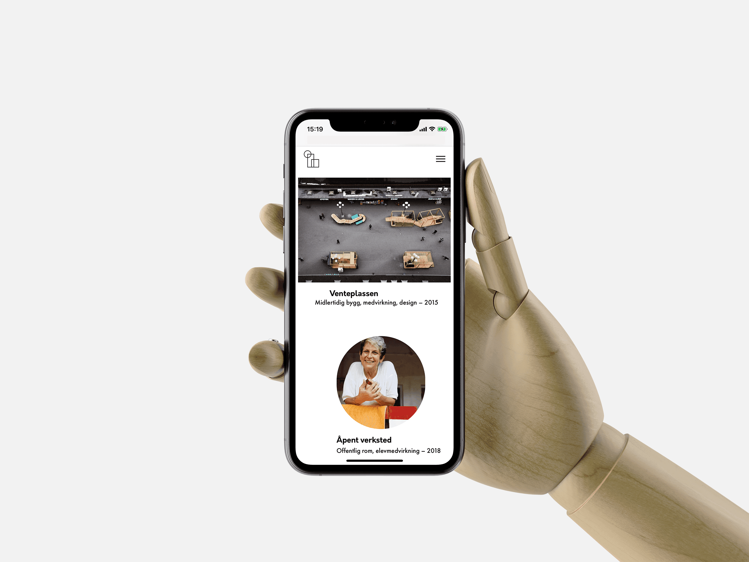
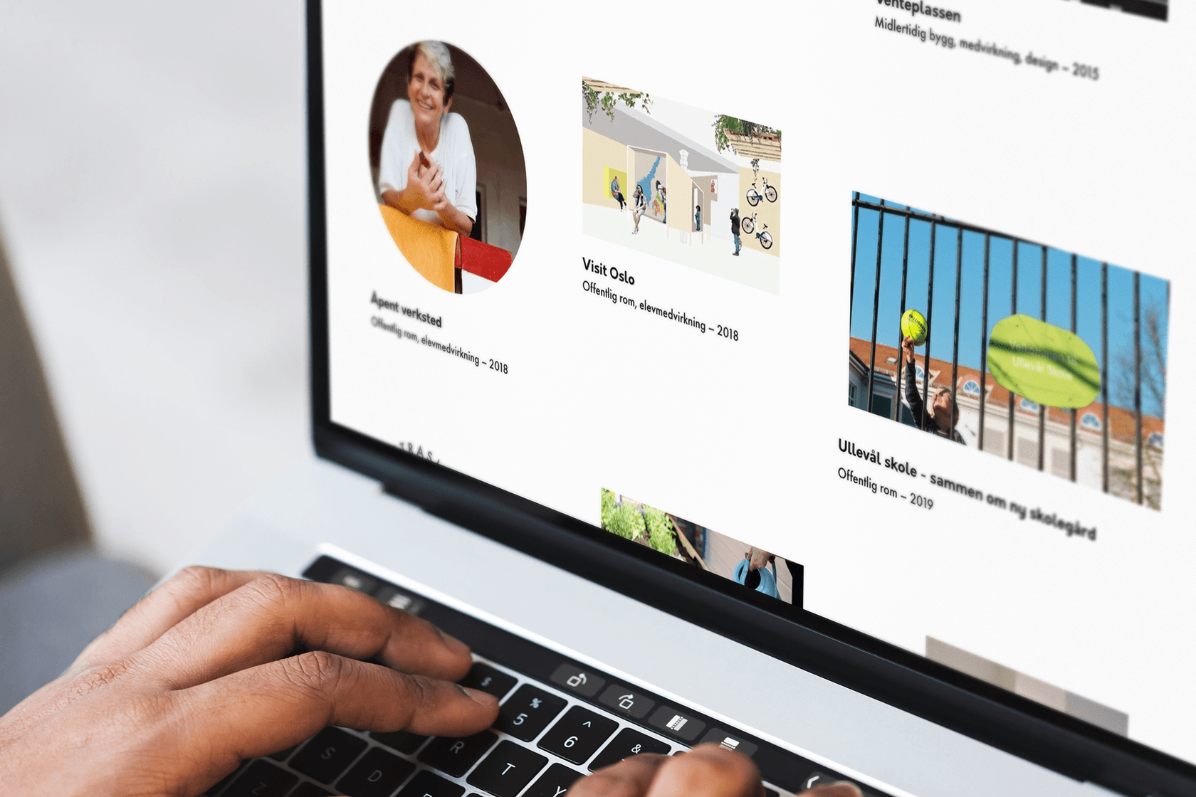
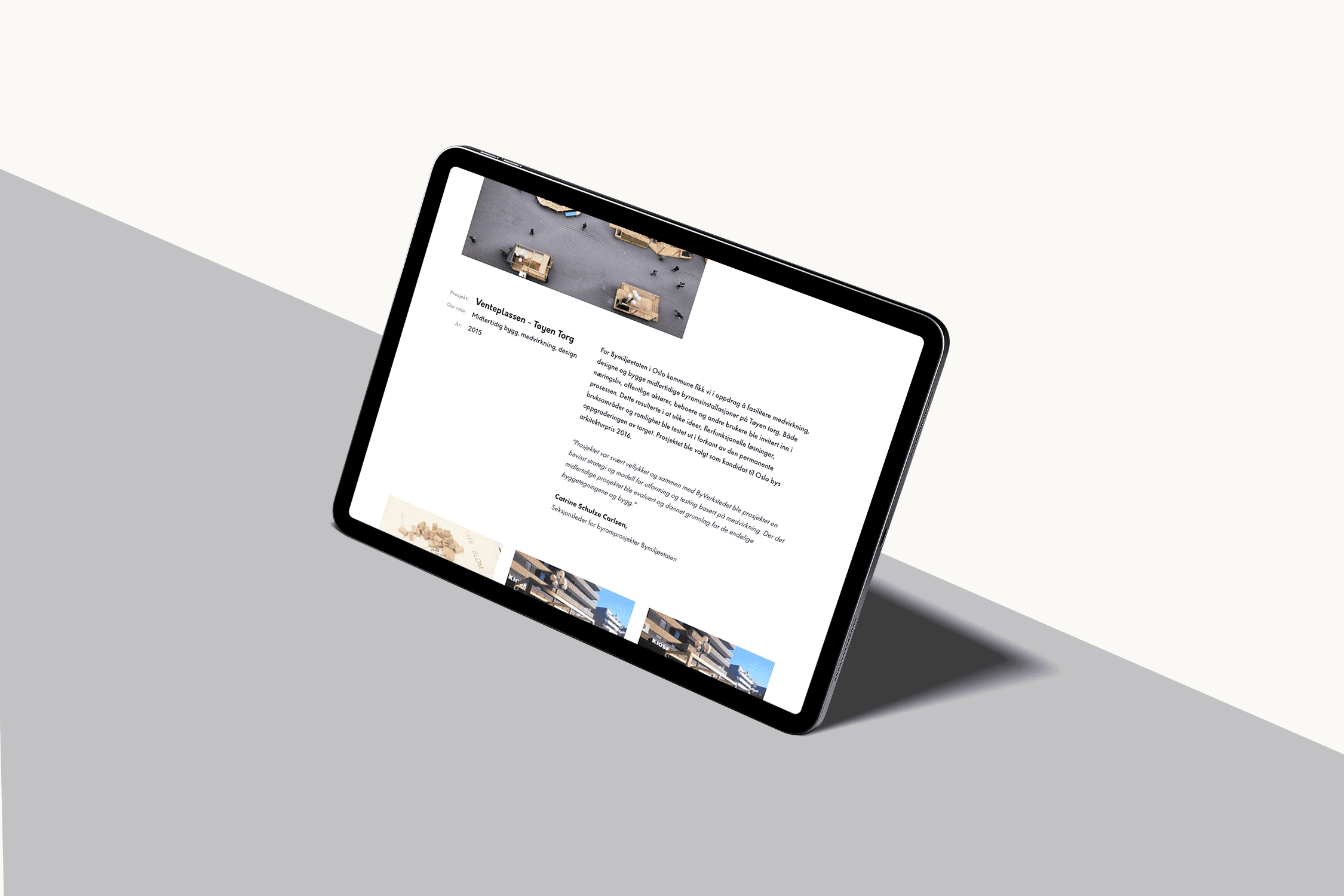
We designed the site to let the photography lead. Each project is presented through images and stories rather than corporate descriptions. The layout is open and inviting, mirroring the participatory approach Byverkstedet brings to their urban development work.
“Working with Alkemist on our website has been a true pleasure. Professional collaboration, quality craftsmanship, and great service — we would gladly work with Alkemist again.”
Typography
Two typefaces, one voice
We wanted the typography to be clean and simple, yet fun and playful. Orkney was the perfect choice for headlines — the details in letters like 'w', 'k', and 'y' are playful and modern. We paired it with Futura PT for body text, a classic with wide versatility.
The combination gives Byverkstedet a distinct typographic voice: professional enough for municipal partners and approachable enough for community engagement. Orkney + Futura PT — a pairing that just works.
Responsive design across devices
Starting with sketches
Every website starts with sketches. We explored multiple directions for layout and navigation before landing on a structure that puts projects front and center. The information architecture is flat and intuitive — visitors can find what they need without getting lost in nested pages.
The color palette stays restrained, using warm neutrals so that the project photography provides the color and energy. This was a deliberate choice — Byverkstedet's work is visually rich, and the website design should amplify that rather than compete with it.
The result
The new website gives Byverkstedet a digital presence that matches their ambitions. It communicates their core message clearly: they are people who create more inclusive cities through collaboration, design, and hands-on craft.
The site works as both a portfolio of past projects and an invitation to future collaborators. Municipal partners, community members, and potential clients can all find what they need — and understand what Byverkstedet is about within seconds of landing on the page.