Identity for a cause that needed to be taken seriously
How you design for drug policy reform without making it look like a poster for a student union. The work, the constraints, and what it means to have a client whose success is measured in lives.
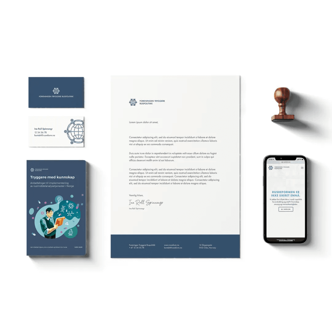
Foreningen Tryggere Ruspolitikk (The Association for Safer Drug Policies) is the most cited voice in Norwegian drug policy reform. When they came to us in 2020, they had the evidence, the policy papers, and the expert support — but the visual identity signalled student activism, not institutional authority. Everything we have built since has been about closing that gap.
The scope has grown over five years: a complete brand identity, four national campaigns, two annual conference brands, a harm reduction web platform, an award identity, and an evolving social media system. This is a record of that work.
The identity
Norway's drug policy debate is uniquely charged. The Rusreform — the proposed decriminalisation of personal drug use — was rejected by Parliament in 2021 despite broad expert support. The organisation needed to look like it had already won the argument. Not aggressive, not defensive — settled. Like an institution that happened to be right.
We anchored everything in typography. A single typeface used with authority — no decoration, no icons. The colour system is deliberately restrained: a dark navy close to government blue for authority, white for clarity, and a muted amber accent used only for data highlights and calls to action. The primary mark is a wordmark. An icon would trivialise the subject.
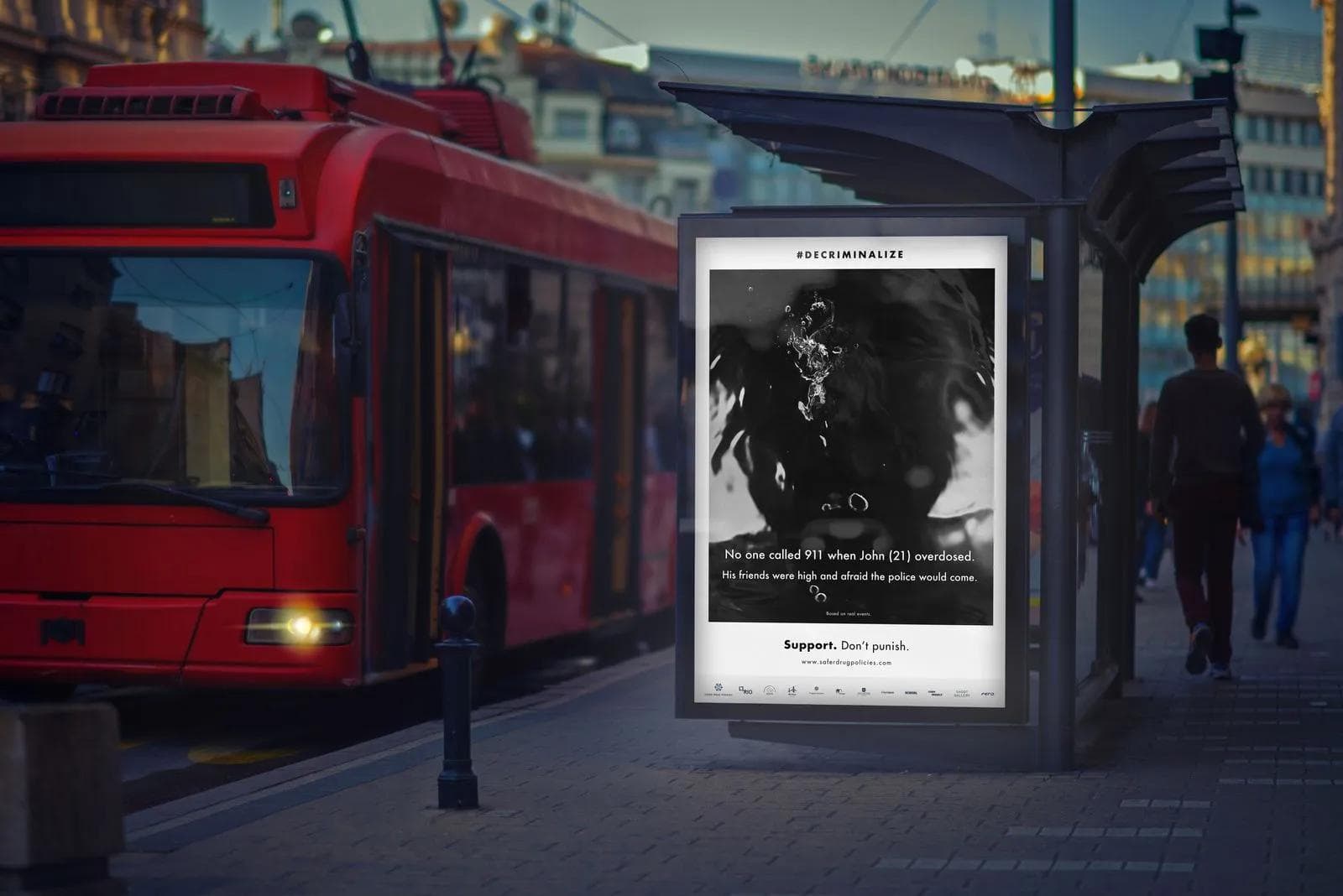
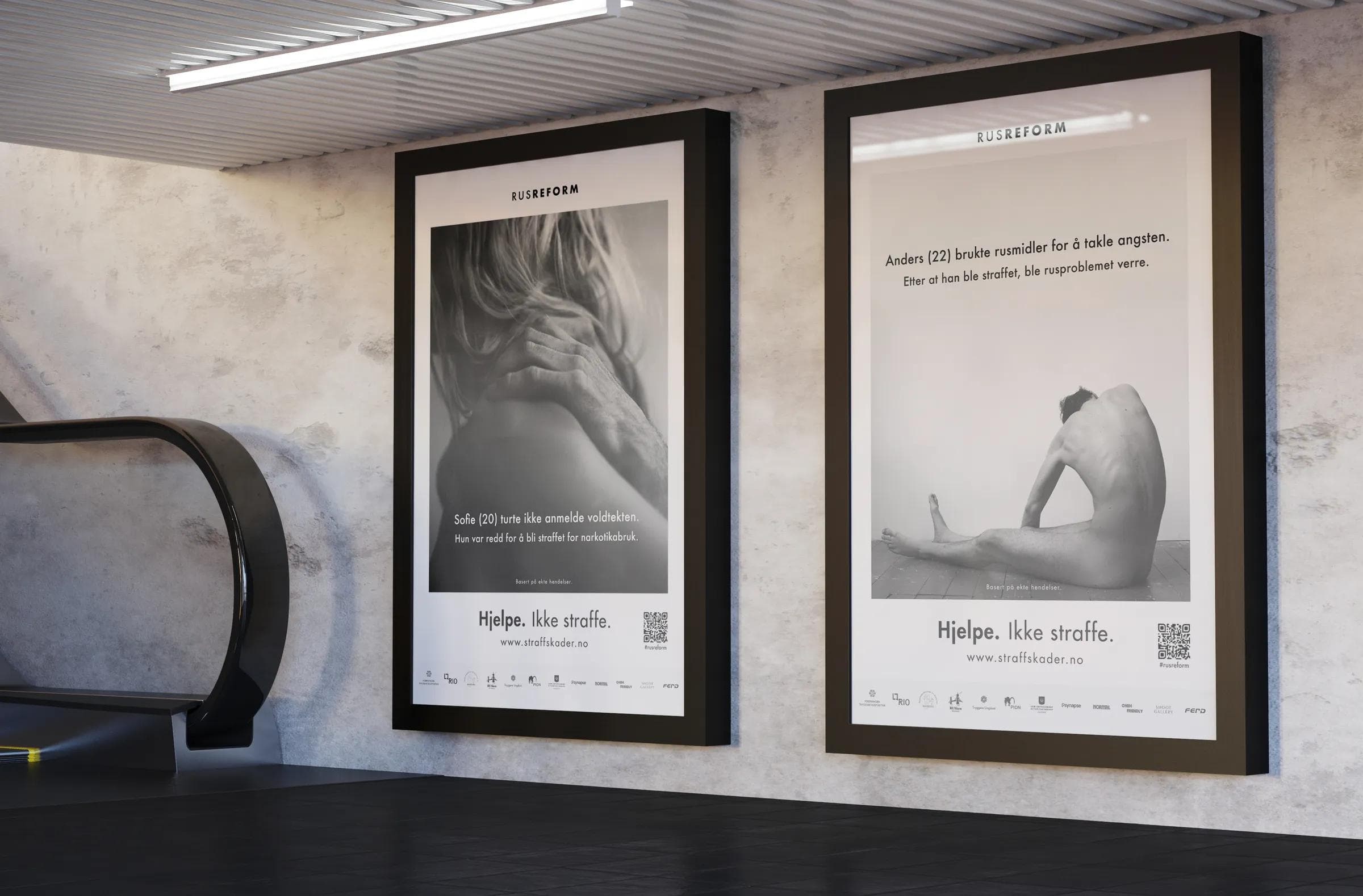
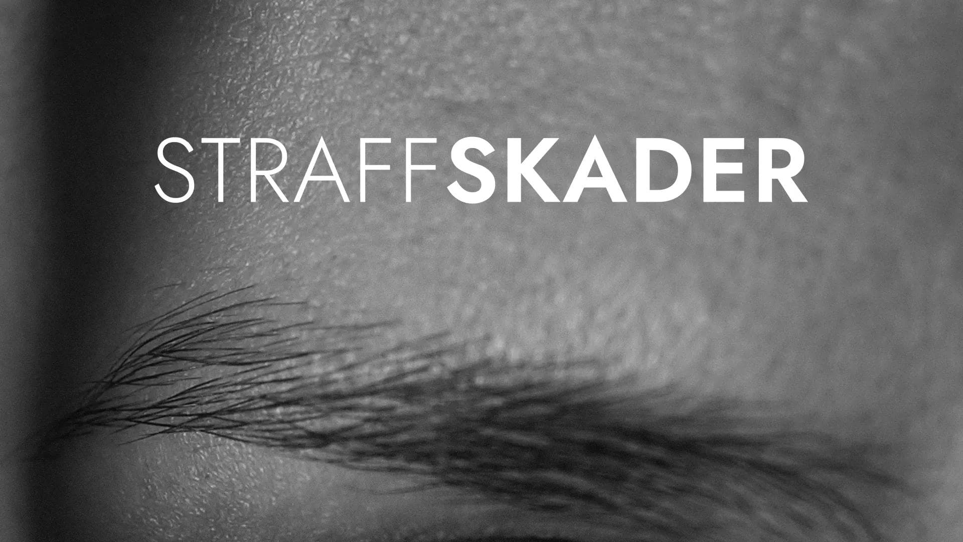
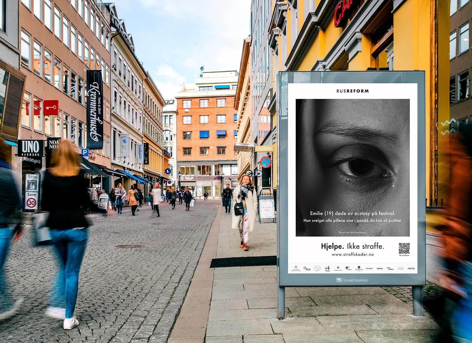
#Decriminalize — the Straff Skader campaign
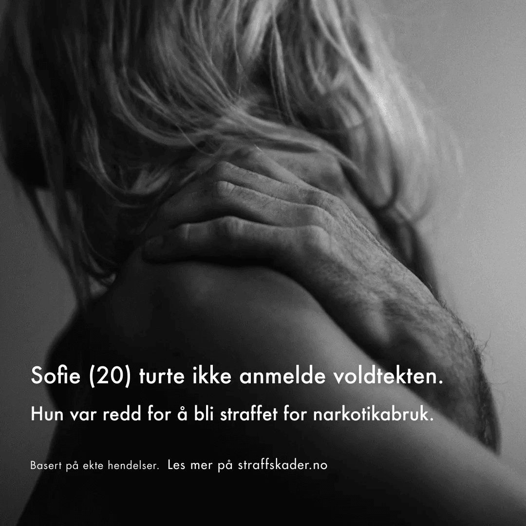
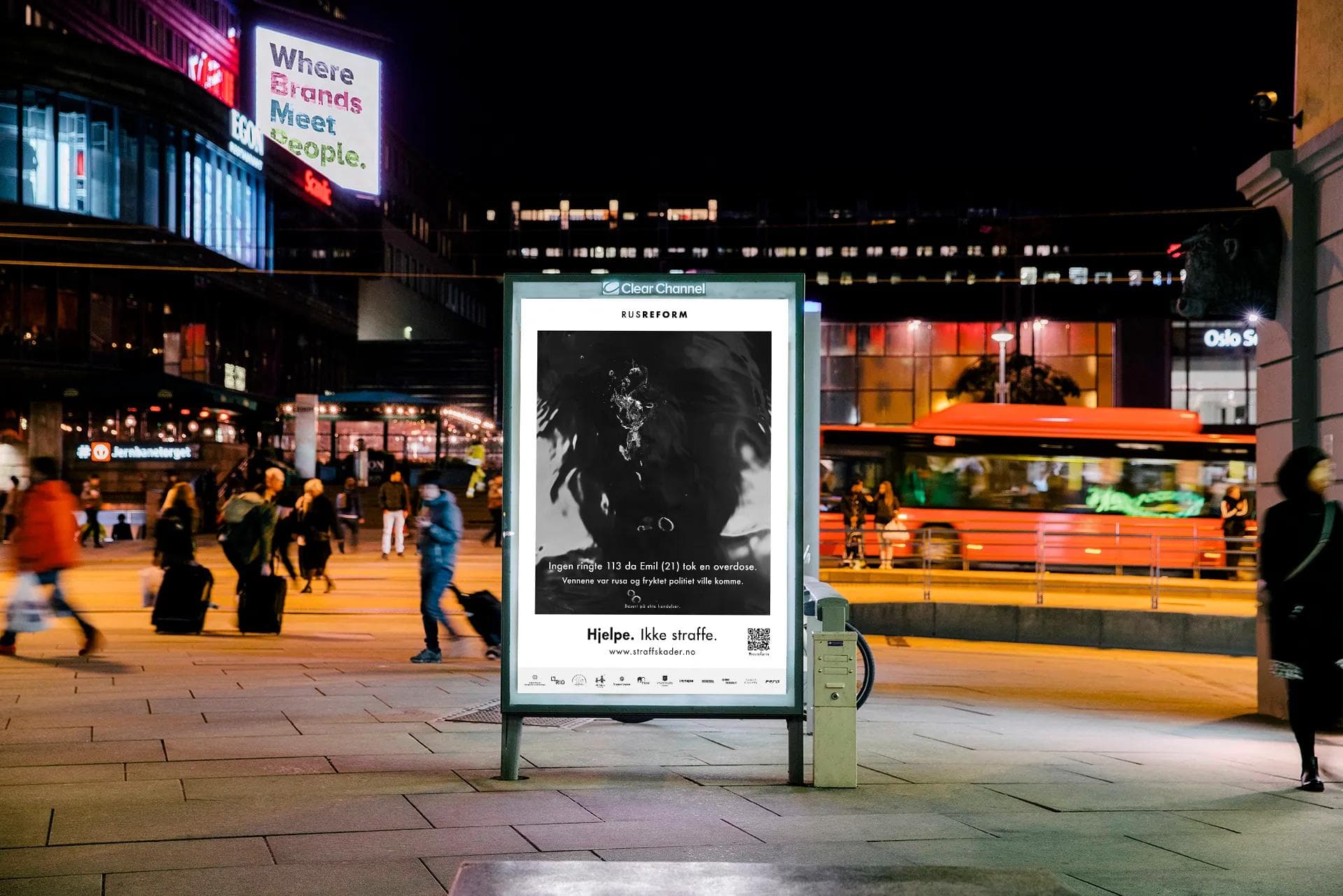
Straff Skader (Punishment Damages) is the campaign that made the organisation impossible to ignore. The concept is simple and devastating: real stories of people harmed not by drugs, but by the criminalisation of drugs. Each story follows the same format — a name, an age, and a consequence that should never have happened.
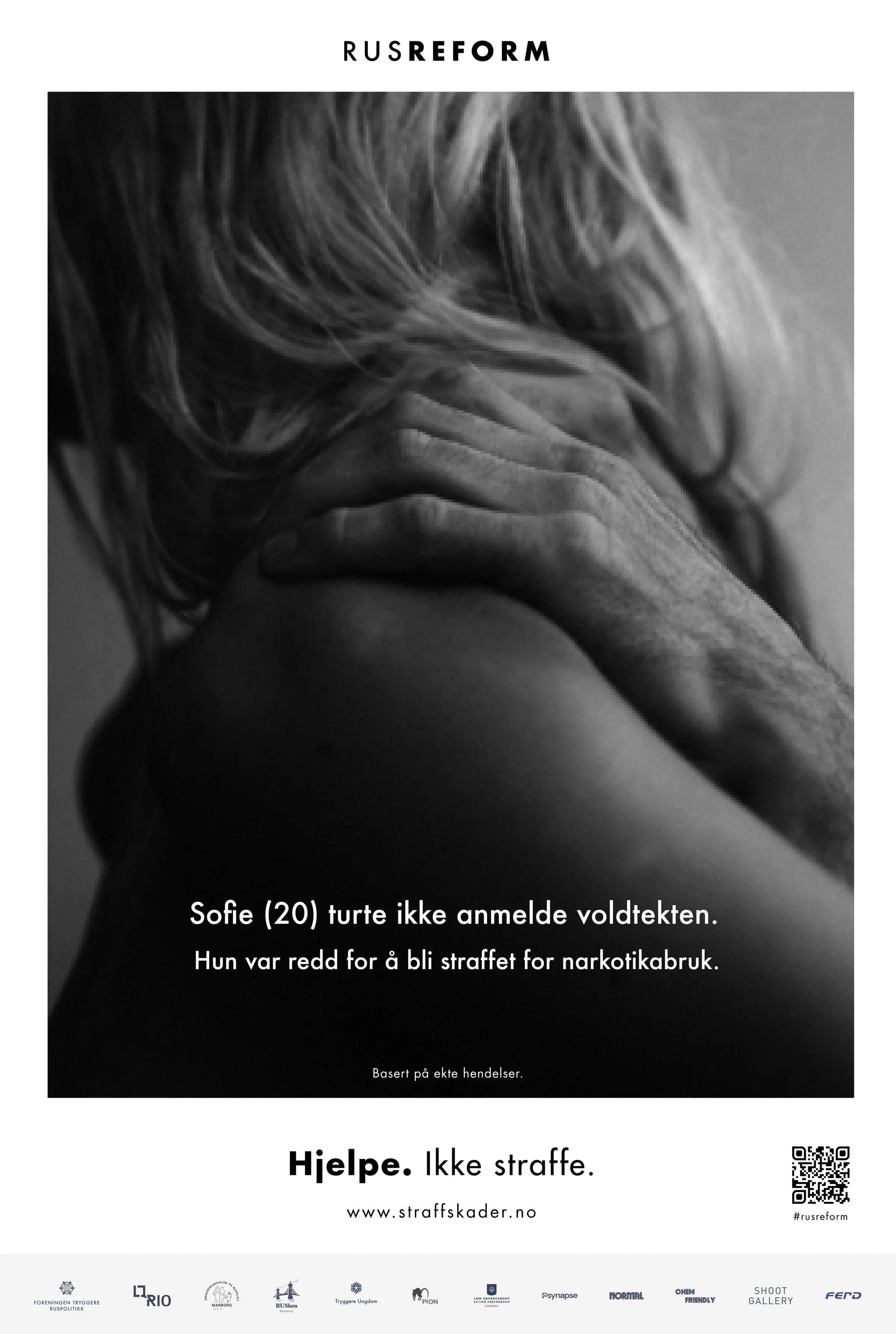
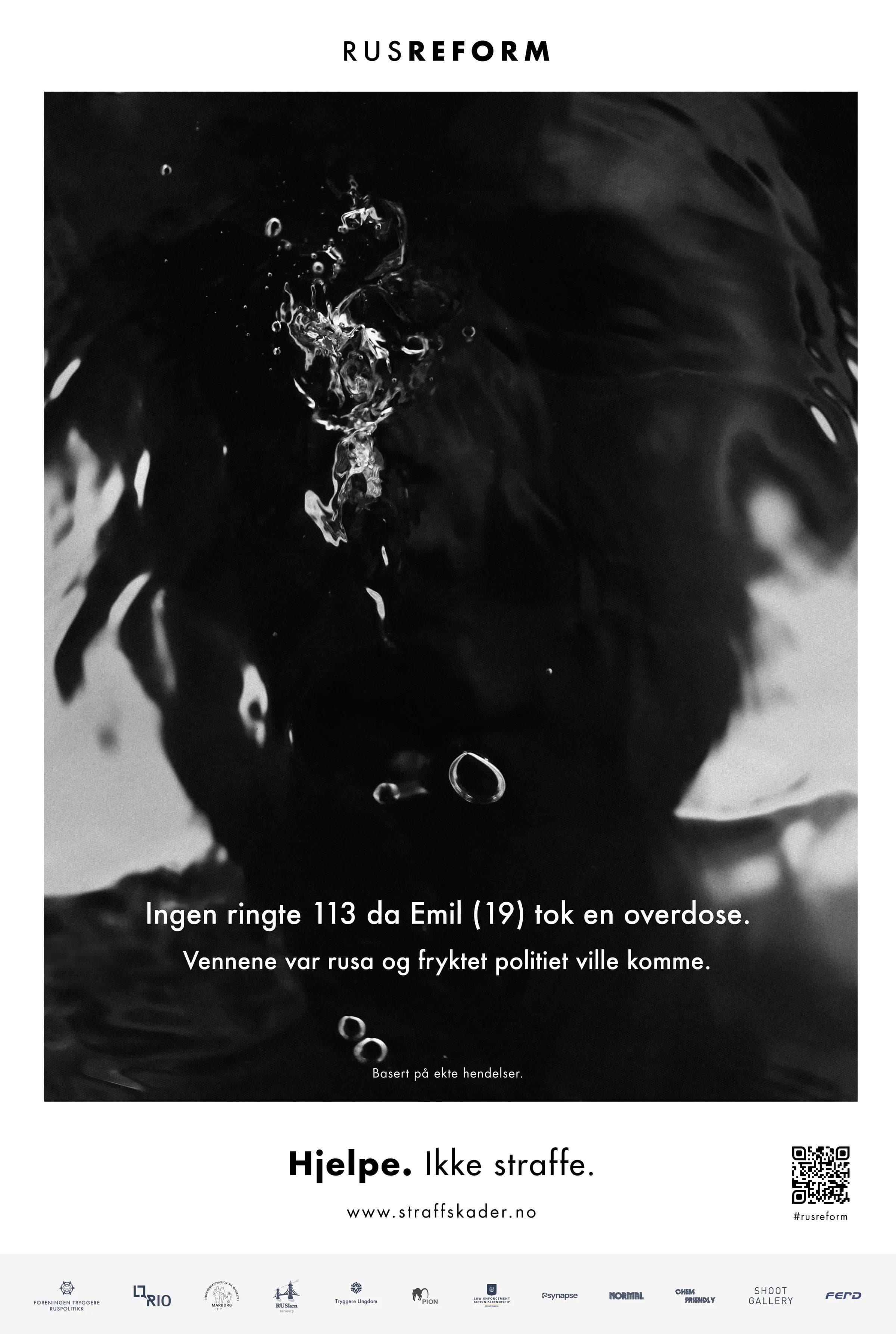
Sofie, 20, who didn't dare report her rape because she feared prosecution for drug use. Emil, 19, whose friends didn't call 113 during his overdose because they were afraid the police would come. Each story is based on real events, verified by the organisation's research team, and presented in stark black-and-white photography with the tagline: Hjelpe. Ikke straffe. (Help. Not punish.)
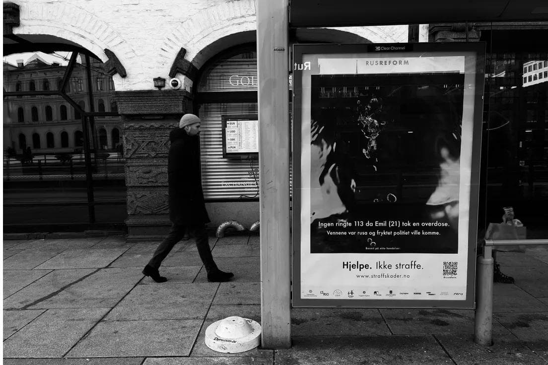
The campaign ran across outdoor, digital, transit, and social media in Oslo and Bergen. The design gets out of the way of the content entirely — no colour, no decoration. Just typography, white space, and facts that speak for themselves.
“Sofie (20) turte ikke anmelde voldtekten. Hun var redd for å bli straffet for narkotikabruk.”
The campaign in the streets
Rusopplysningen — harm reduction that saves lives
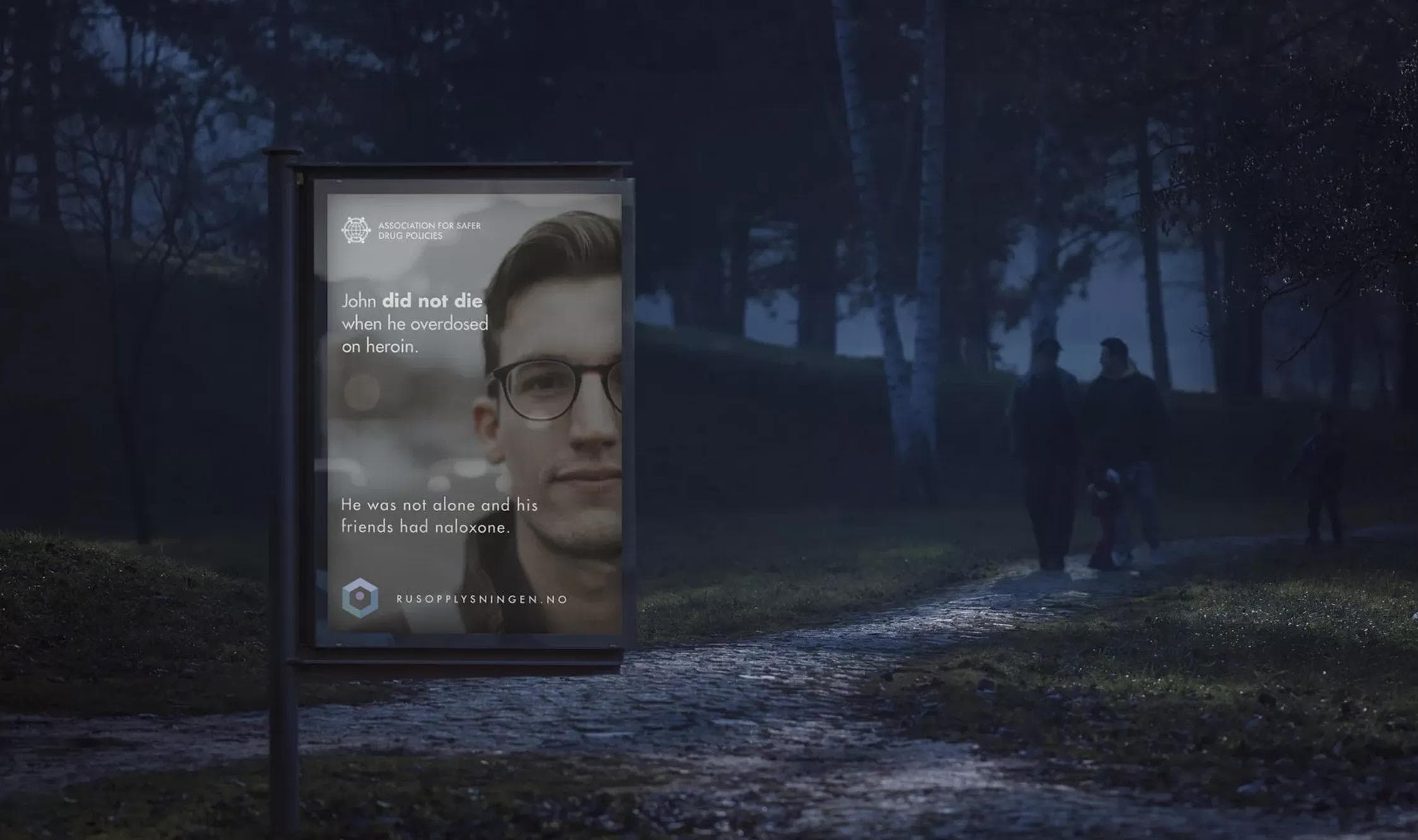
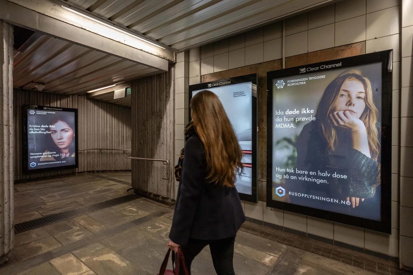
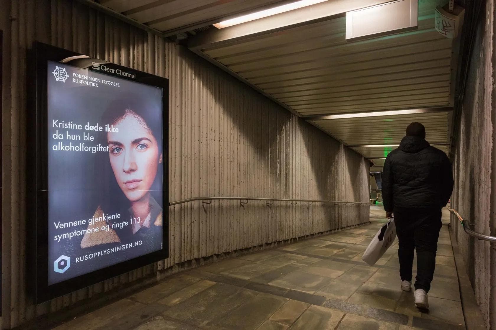
Rusopplysningen (The Drug Information Service) is the organisation's harm reduction platform — a website and campaign that reframes the conversation from punishment to prevention. Where the Straff Skader campaign shows what goes wrong under criminalisation, Rusopplysningen shows what goes right under harm reduction.
The campaign inverts the structure of the Straff Skader stories. Instead of 'X happened because of criminalisation', the format is 'X did not die because of harm reduction'. Sophie did not die when she tried LSD — she'd had the substance tested. John did not die when he overdosed on heroin — his friends had naloxone. Kristine did not die from alcohol poisoning — her friends recognised the symptoms and called 113.
The website at rusopplysningen.no provides evidence-based information about substances, risk reduction, and where to get help — designed to be trusted by people who don't trust institutions. We built it to feel clinical without feeling cold, authoritative without feeling judgemental.
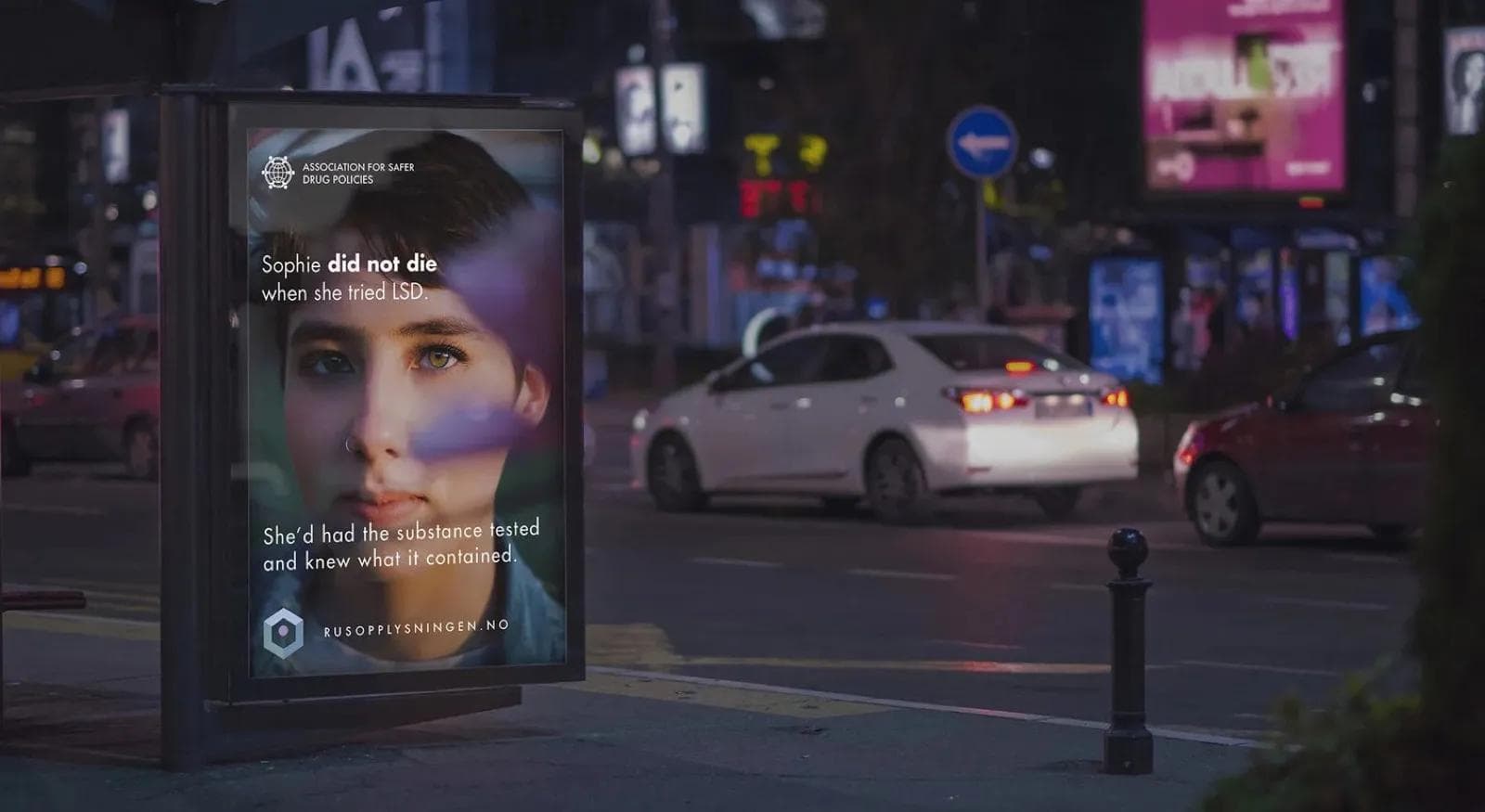
Rusopplysningen in the streets
Rusreformkonferansen
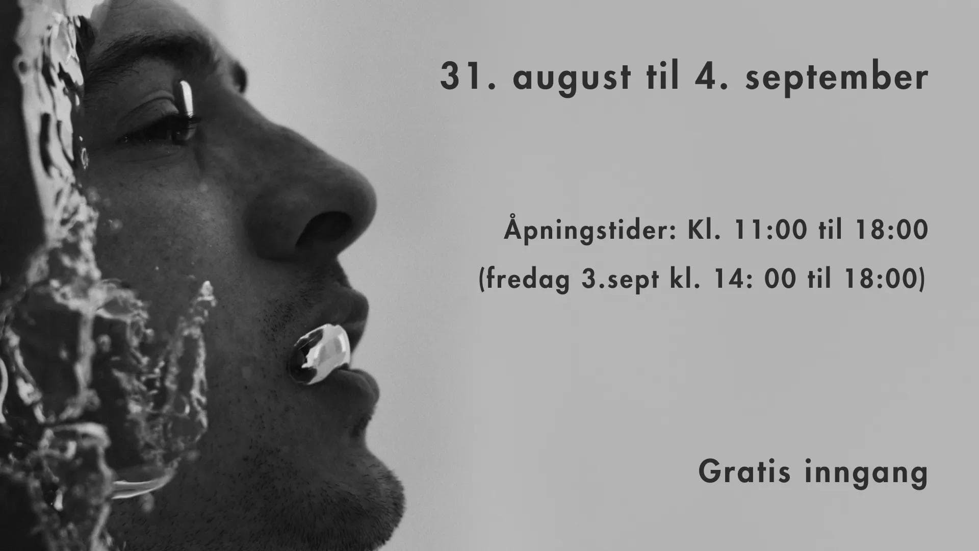
Rusreformkonferansen (The Drug Reform Conference) is the organisation's annual event — the primary gathering for policymakers, researchers, journalists, and advocates in Norway's drug policy space. We design everything: the visual identity, stage graphics, streaming overlays, exhibition materials, and the signage that fills the venue.
The conference identity uses a warm amber-to-orange gradient — a deliberate departure from the organisation's cooler navy palette. The warmth signals openness and dialogue, while the typography stays institutional. The conference has been held at venues including Griegsalen in Bergen, where the campaign photography was exhibited in the foyer alongside the policy programme.
Conference design and venue
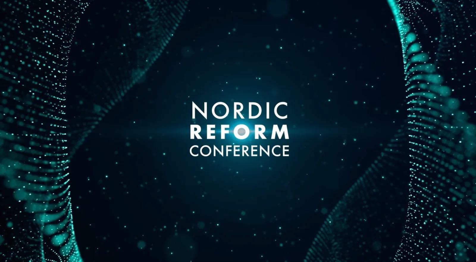
Nordic Reform Conference
The Nordic Reform Conference is the international counterpart — a cross-border event bringing together reform voices from across the Nordics. The identity takes a different direction: dark, data-driven, and future-facing. Generative particle graphics in cyan against deep teal-black, suggesting data visualisation and scientific rigour.
Where Rusreformkonferansen is warm and domestic, Nordic Reform is cool and international. The two conferences share an organisation but speak to different audiences, and the visual identities reflect that.
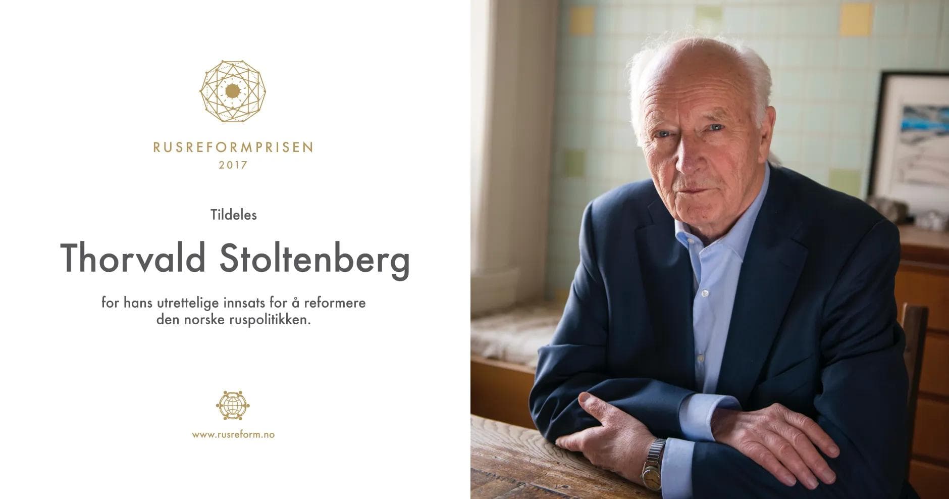
Rusreformprisen
Rusreformprisen (The Drug Reform Prize) is awarded annually to individuals who have made significant contributions to drug policy reform in Norway. We designed the award identity — a gold geodesic sphere mark that conveys both scientific precision and human interconnection. Past recipients include Thorvald Stoltenberg, the former foreign minister, for his lifelong advocacy.
What it means to work on this
This is the kind of work that reminds you why design matters — not in a vague, inspirational sense, but concretely. When a campaign generates press coverage that shifts a parliamentary conversation, when an organisation looks credible enough that a family in crisis trusts them, that is design doing something real.
In the five years we have worked with Tryggere Ruspolitikk, the organisation has grown from a small advocacy group to one of the most cited voices in Norwegian drug policy. Harm reduction is no longer a fringe position in Norwegian politics. It is mainstream. Design did not cause that shift. Evidence did. Policy work did. Tireless advocacy did. But design made the message legible.
“Design did not cause the shift in drug policy. Evidence did. But design made the message legible. It gave the evidence a container that people trusted.”